How does the use of color impact the emotional feel of a piece and can it add significantly to the message of the illustration?
Black and white images can have emotional feelings like color images but where color has an advantage is that the range of choices becomes truly vast. One has to be trained in a good foundational understanding of color to be able to have a consistent mastery over their illustrations.
Improperly placed colors can kill a piece's impact just as quickly as the good color scheme can pull us in.
Colors have an evocative inner-appeal to the viewer that allows them to discern meaning from their surroundings. This translates into how they may view works of art as well. With the proper use of colors you can evoke the emotional response that you wish to convey or even transmit subtle information that seems more implied. For instance, a sepia tinted image conveys an aged quality. Corporations tend to avoid
sepia in their marketing strategies because it doesn't have that immediacy or the pop that a red or an orange will have on first glance.
Sometimes we are limited to a certain number of colors in print by the budget or even the ability of a certain type of press to reproduce different colors accurately. In those situations we have to have a good working knowledge of color so that we can still convey that emotional appeal we are seeking to get from our viewers.
We also have to know our intended audience because some colors have different meanings in different cultures around the world. You wouldn't want to find yourself working on a brochure detailing the problems of color blindness and have your working color scheme be in greens and reds. But keep in mind their are those with blue & yellow color blindness too. In fact it is a whole subject worthy of study apart from this blog post.
But having an emotional impact through the use of color can be seen throughout art history. The loud orange and deep blues of Edvard Munch's, "The Scream" highlight the agony and impact of the figure in the image rendered in a very loose style. Here we see the colors adding greatly to the image's emotional impact. Whereas had the color scheme been in greens and yellows we would have thought the figure
was sick or ill perhaps.
Yes the emotional feel of a piece can be greatly altered by the colors you choose, be they a full color range or as simple as a monochromatic color scheme. Colors can be an illustrators tool to help present the image in more ways than just line work or shading.
Saturday, November 28, 2009
Thursday, November 26, 2009
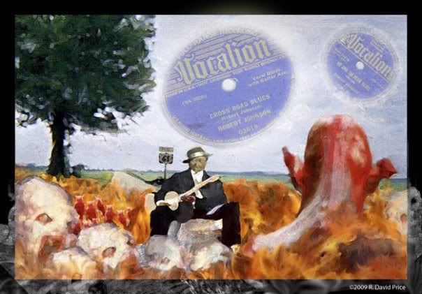
Illustration Friday Topic: Music
This weeks Illustration Friday topic is music. I've been listening to lots of blues lately and decided to experiment with some new brushes in Photoshop. So I created this digital painting with Photoshop CS4. This is an image of the birth of the career of Blues Legend, Robert Johnson who has legend has it, wanted to learn to play the blues and went down to the Crossroads and made a deal with the devil by selling his soul to learn to play the blues. This is my interpretation of what happened out on Highway 61 deep in the heart of the Mississsippi Delta region.
 <
<
<
Subscribe to:
Posts (Atom)